
Product design · Aug ’25 — Feb ’26
Safe Logist
Redesign of a B2B contractor verification platform
SafeLogist helps verify logistics companies and contractors across a large set of data: registration details, finances, court cases, executives, founders, connections and other parameters.
I joined a product that was already underway and reworked its unfinished design concept: the structure, the key flows and the way data is presented.
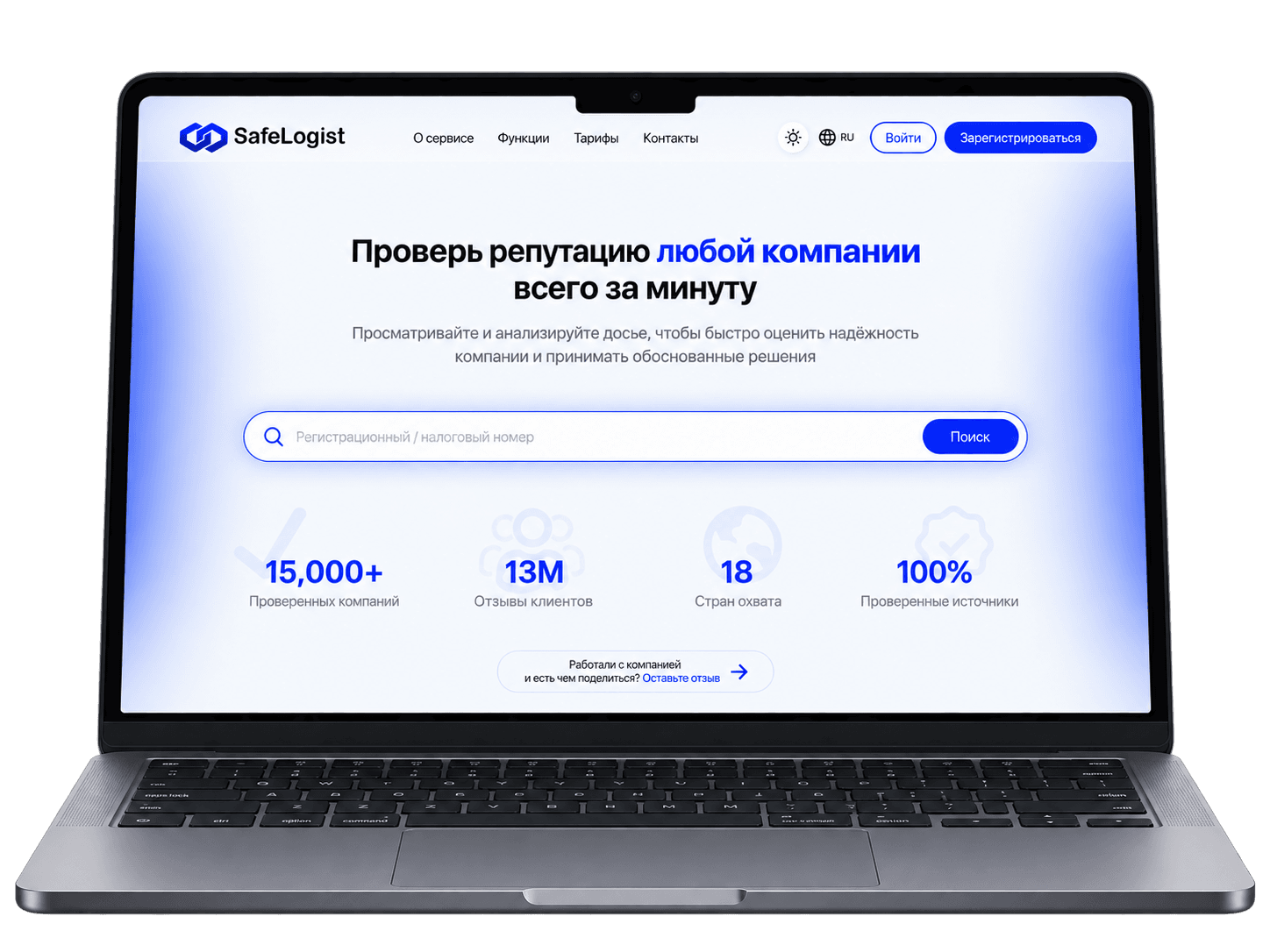
I joined a product already in progress →
An unfinished design concept already existed. Some screens and the basic logic had been defined, but the product did not yet add up to a coherent system.
My job was to carry the work forward, rebuild the problem areas and bring the interface to a state that could be handed over to engineering.
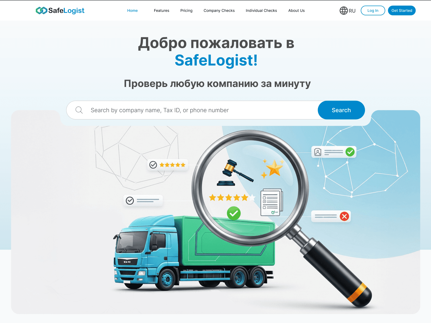
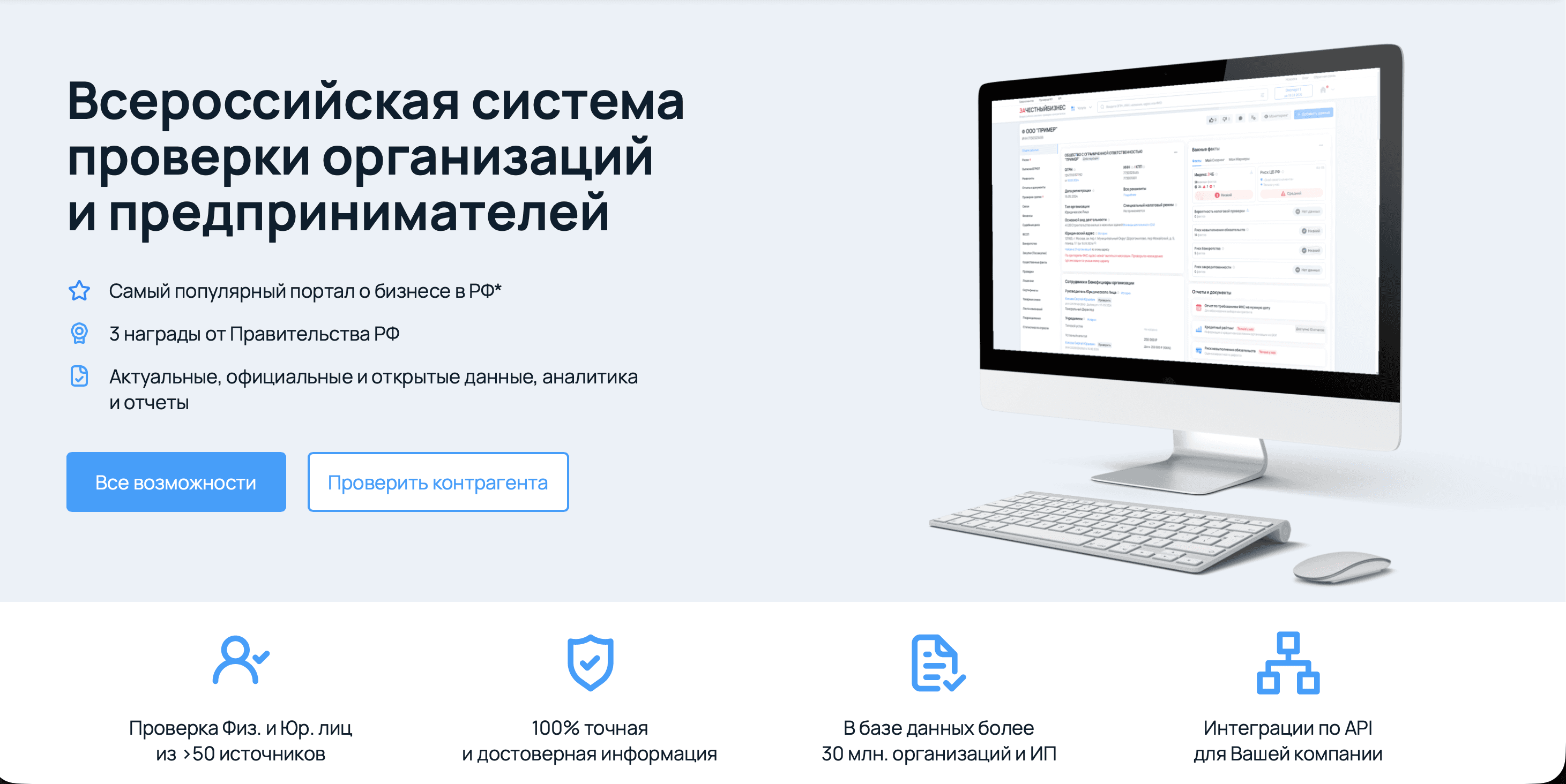
Competitive analysis
First I looked at how the market solves this →
Before the redesign I studied services for verifying companies and contractors: how they build the company card, group data and present financial, legal and registration information.
Functionally the solutions were similar, but visually many products looked rather uniform and neutral. So one of the goals became not only to organise the data, but to give SafeLogist a visual character of its own.
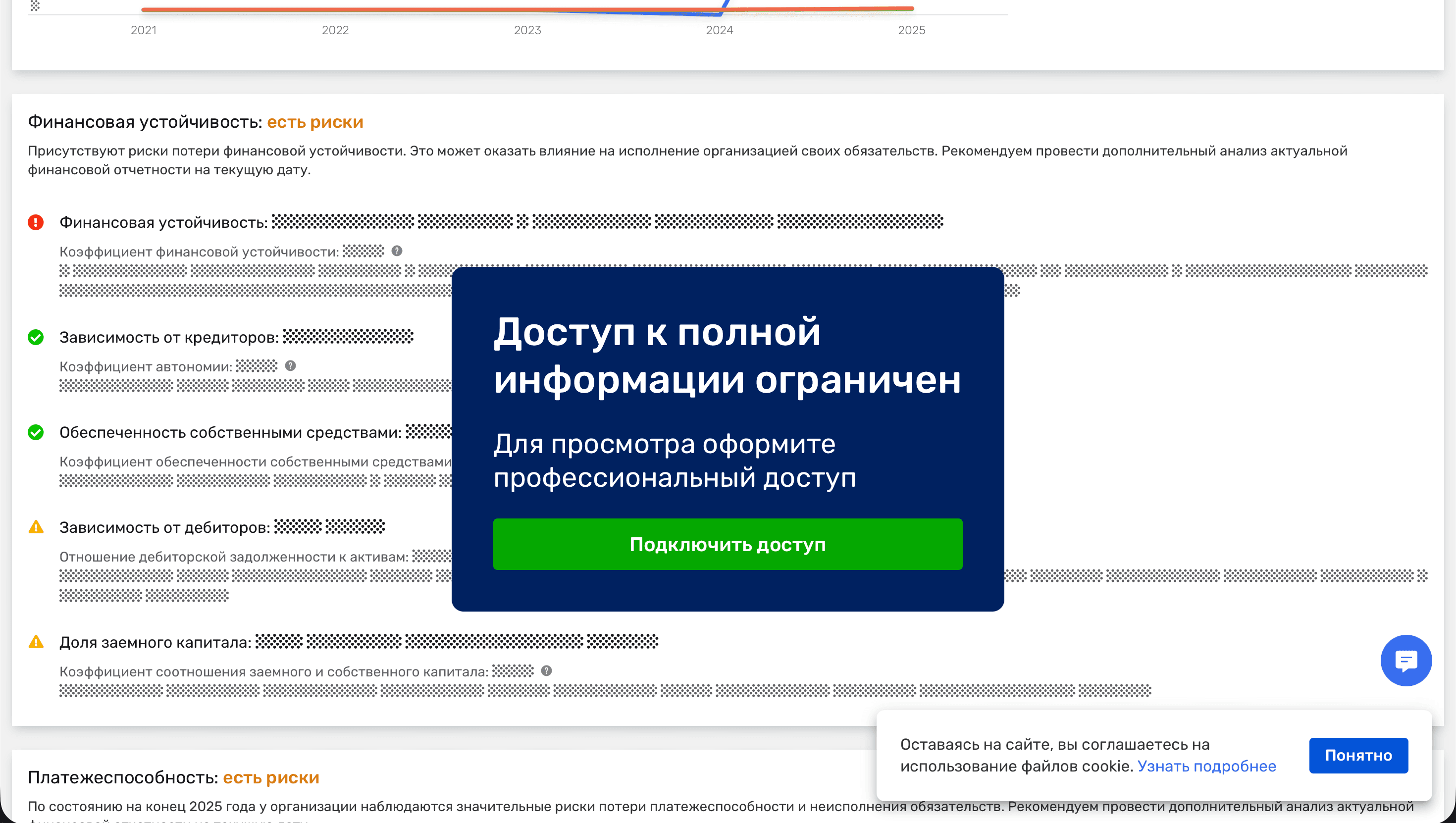
The hardest part of the project was the volume of data
The task was not just to fit everything on screen, but to make disparate information manageable.
I built the interface around progressive disclosure. First the user gets the core facts about the company and the general context, then picks the section they care about, and only after that goes into the detailed data.
This kept the whole body of information from appearing at once and preserved clear navigation between different types of data.
Many different types of information had to come together in one place while keeping a clear reading order.
The key facts are available immediately, and more specialised data is moved into separate sections. The user can get the general context quickly and then choose how deep to go.
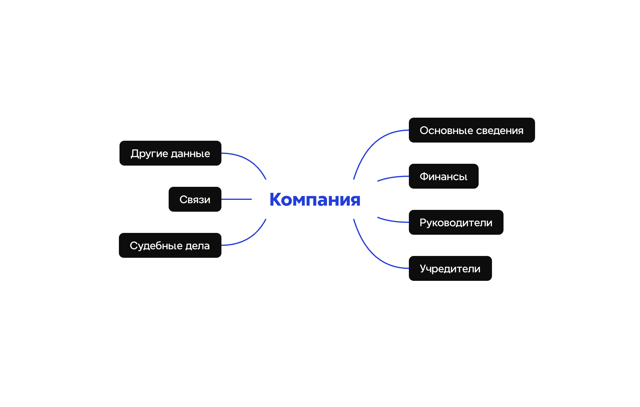
Information architecture
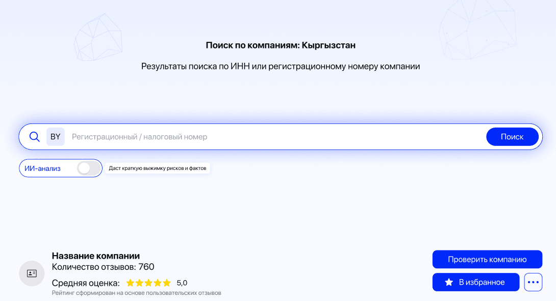
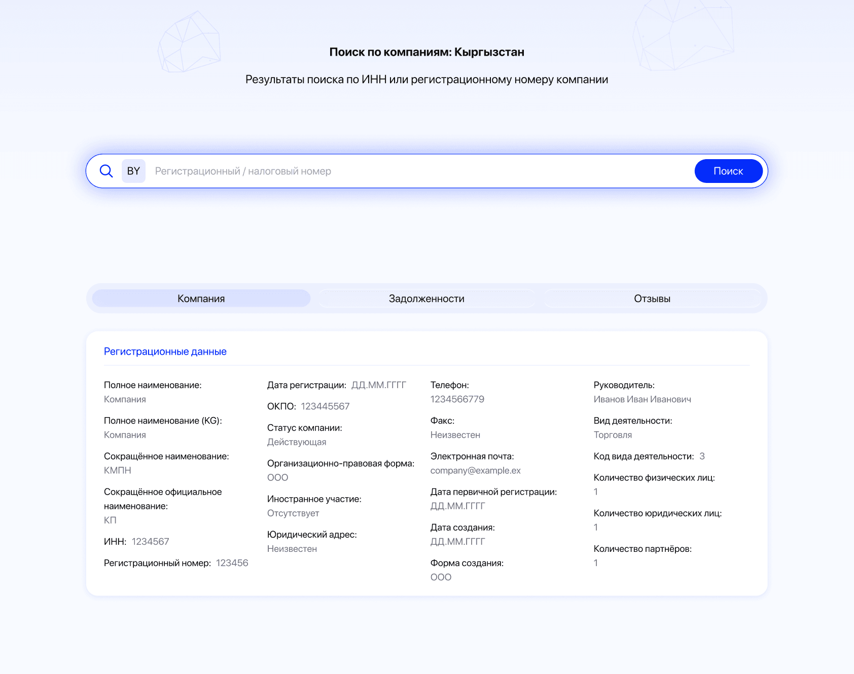
Search by tax or registration number stays at the top of the page, so the user can move to another contractor straight away without going back
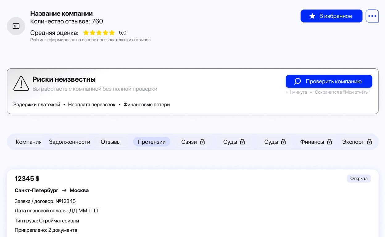
After the search the user immediately sees the rating, the risk status and navigation through the company data — from debts and reviews to connections, court cases and finances
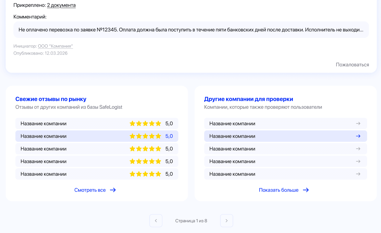
At the end of the page there are recent market reviews and other companies to check — extra context that lets the user continue the analysis without a new search
Iterations and trade-offs
Not every part of a product needs to be taken to a theoretical ideal
Because there was so much data, certain parts of the interface could have been explored and rebuilt much further. The blocks with general company information, finances and founders, for example, are ones I would still try to assemble in several other ways.
But that level of work would have multiplied the project timeline. So we settled on a solution that was clear enough, consistent and realistic to build.
Business constraints
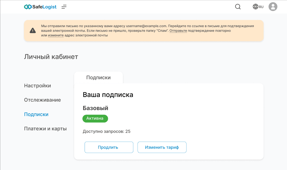
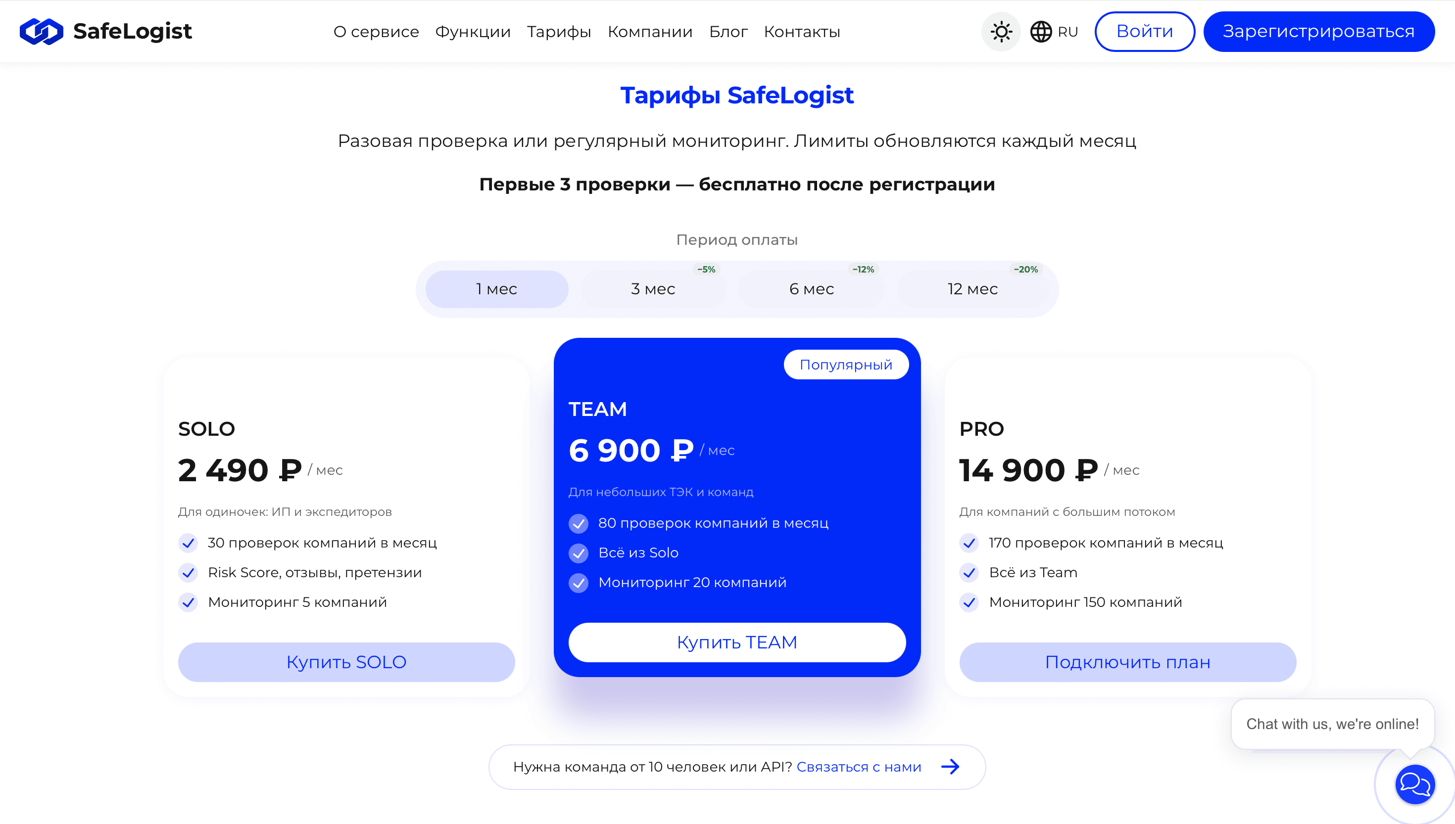
The paid features were a constraint of their own. I could see ways to organise monetisation differently and to split the free and paid flows, but the client wanted to keep the business model they had chosen.
So my job was not to rework the commercial logic entirely, but to make it clear to the user within the given conditions.
Before / after
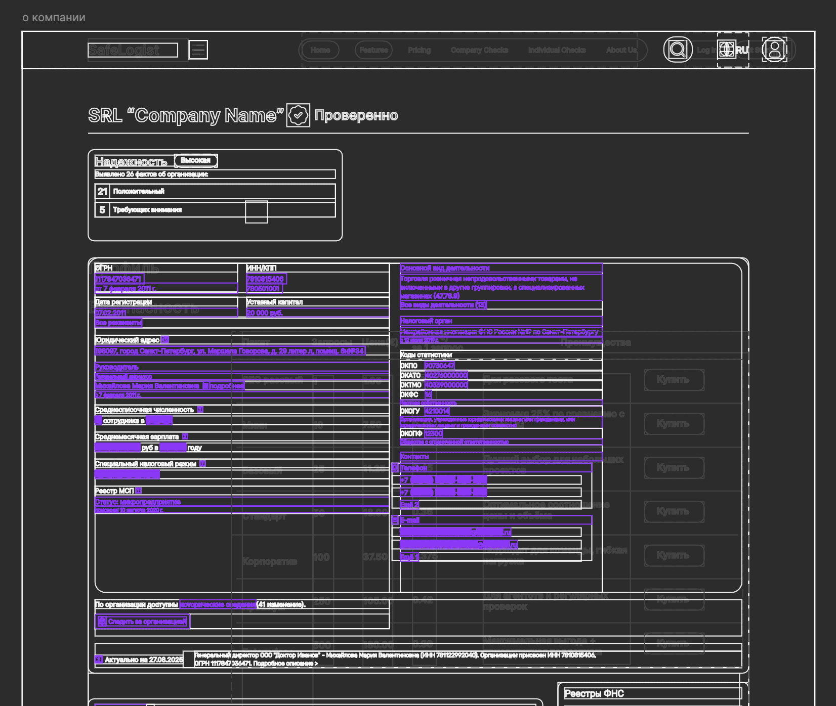
Before
On the surface — a working interface.
Underneath — a structure that was hard to maintain.
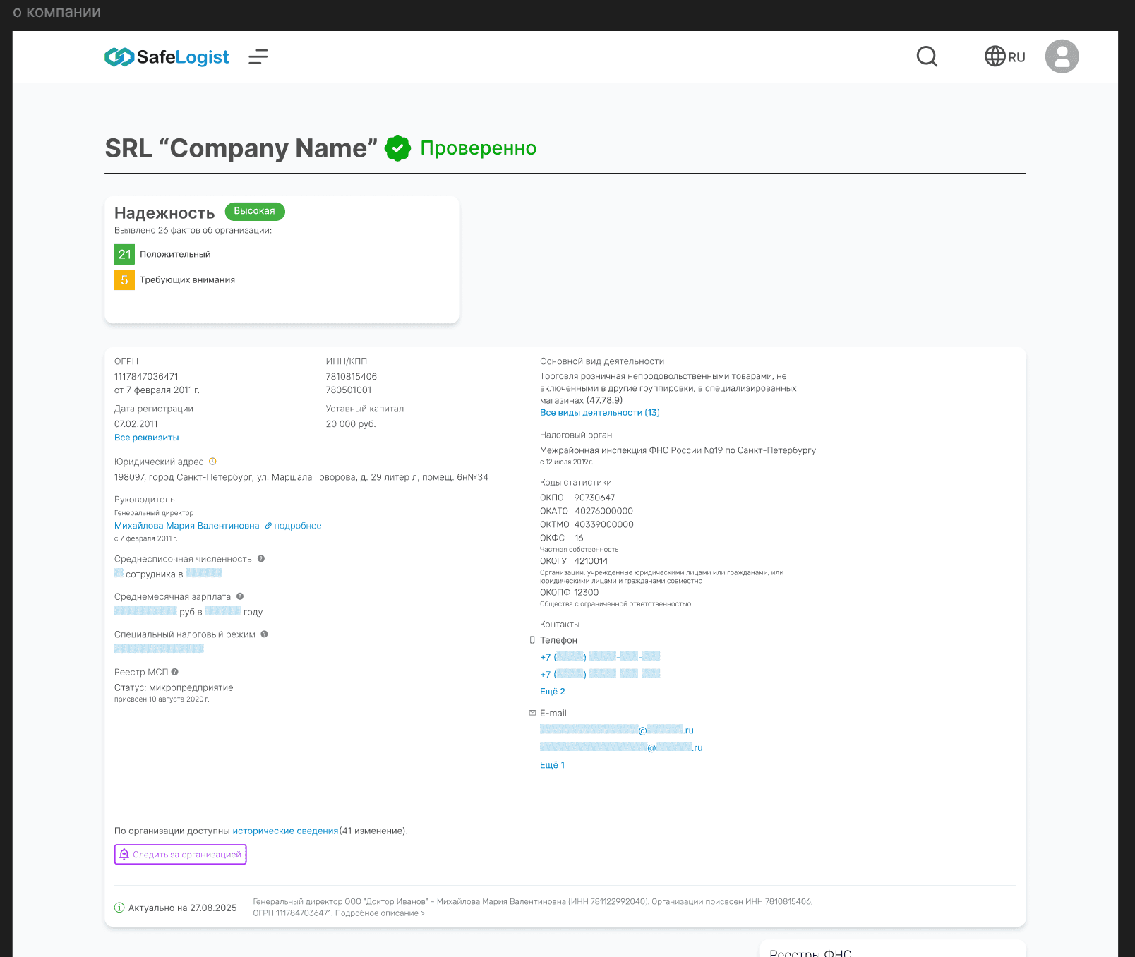
Visually the previous concept looked reasonably put together, but inside Figma almost every element existed on its own: text layers were not tied to containers, blocks were assembled by manual positioning, and repeating elements were not systematised through components and Auto Layout.
Because of that, even small changes meant moving neighbouring elements by hand, and creating responsive versions turned into rebuilding screens almost from scratch.
After
On the surface — a coherent interface.
Underneath — a system that can be maintained and scaled.
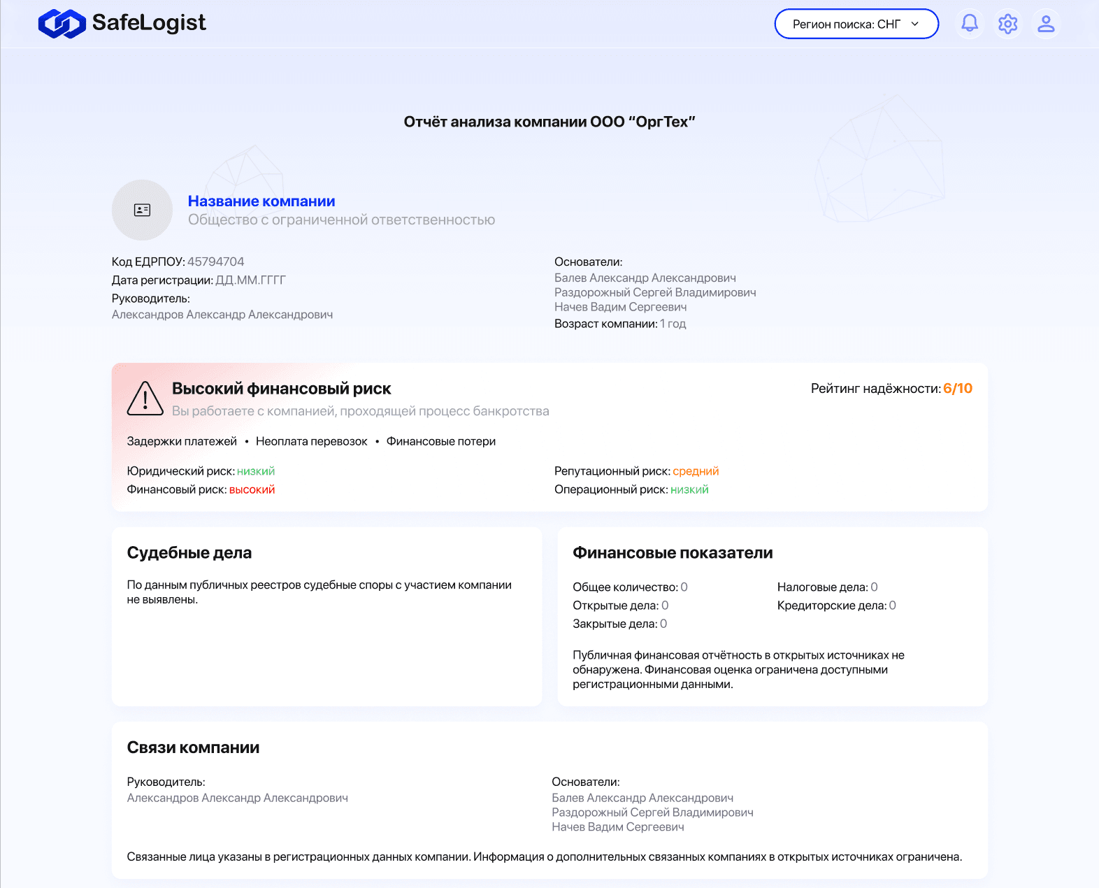
I rebuilt the internal structure of the files completely: moved the screens to Auto Layout, tied content to containers and pulled repeating elements into components. Now changing a piece of text, a block size or a state no longer means rebuilding the whole screen by hand.
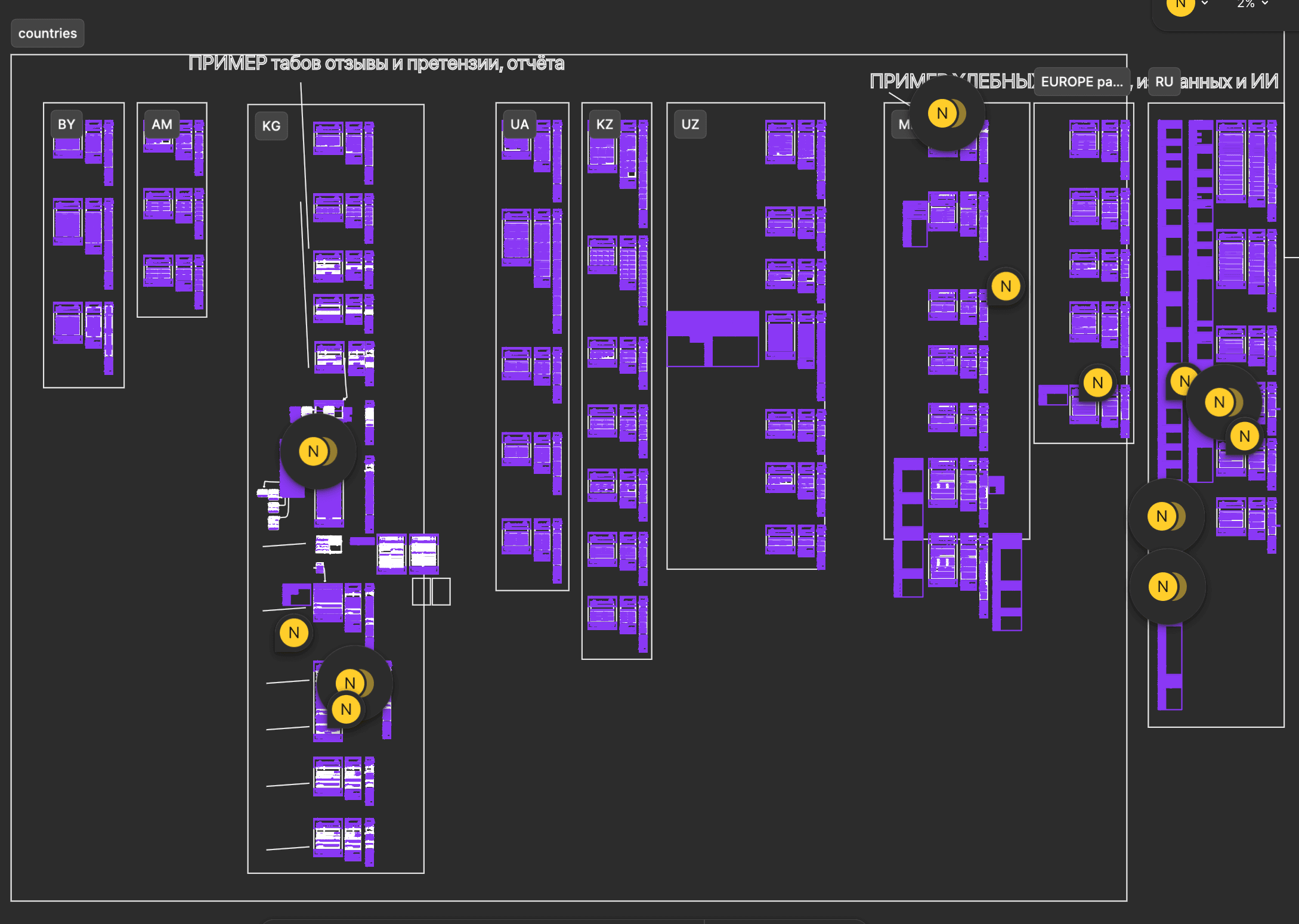
The work was not limited to a single page either. The file holds different flows, states and versions of the product for several countries. Shared rules for components and nesting made it possible to reuse the same logic across the product instead of assembling every new screen from scratch.
Retrospective
What I would change today
Today I would go back to the densest parts of the product: the general company information, the finances and the structure of founders. I would test several alternative groupings and unify the rules for presenting different types of data more strictly.
Separately, I would revisit the paid features and tie the plan limits more clearly to the jobs of different users.
For me this project is a good marker of professional growth: the solution did its job within the timeline and the requirements, but today I can already see where I could make the system stronger.
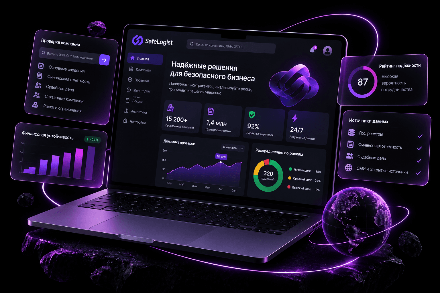
I'm drawn to complex B2B and SaaS systems: lots of data, several roles, connected flows and constraints.
What I enjoy most is the moment when a clear product structure starts to emerge from a pile of requirements.
I'm comfortable with iteration and rework, and I prefer to justify a decision by the user's task rather than by “it looks nicer this way”.